Artastic
Artastic is a case study of an ecommerce site focused on selling high-quality art prints that customers can purchase to decorate the walls of their homes and businesses.
The Goal
Create an e-commerce website focused on selling wall art in the form of canvas prints, framed prints, and posters. It should have a clean and intuitive interface where users can easily search, browse, select, and purchase the products they want.
Competitive Audit
My first step was to research three existing sites dedicated to selling art prints - Artfinder, Fizdi, and Gallerist.

After reviewing these sites, one thing stood out immediately - the overabundance of colors and choices on the landing page. According to Hick’s law, this makes it difficult for a user to make decisions.
The time it takes to make a decision increases with the number and complexity of choices.
While it makes sense for an e-commerce site to feature a wide variety of products, having too many colorful images on the screen can hinder the user by making it harder for them to focus on specific sections of the site. That means my design for Artastic should aim to have a more clean and streamlined layout that reduces visual clutter and allows the user to easily navigate the site.
User Research
My next step in the research process was to find out what kinds of people would buy from an art e-commerce site. To do this, I browsed various articles on the web and also asked in forums such as Reddit and Quora. From this information, I came up with four main categories of potential users for this site.
- Art Enthusiasts and Collectors: These are individuals who have a passion for art and actively seek unique and aesthetically pleasing art prints to add to their collections or display in their spaces.
- Interior Designers and Home Decorators: This category includes professionals and individuals who purchase art prints to complement their interior design concepts or enhance the ambiance and aesthetics of their living spaces.
- Gift Buyers: These are shoppers who buy art prints as gifts for special occasions, considering the recipient's interests, passions, or personal taste.
- Budget Shoppers: This category encompasses individuals seeking art prints, but prioritize affordability above all else.
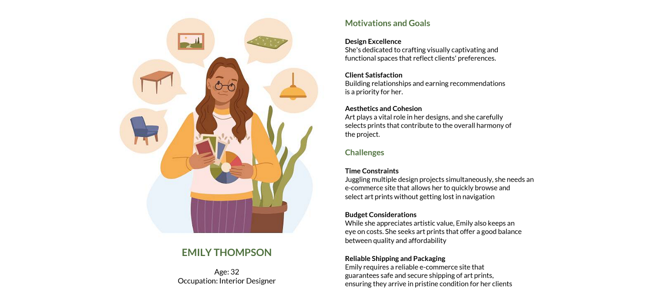
User Persona
After looking at what I've researched from potential users, I created a user persona that takes key elements from the four groups listed above. The user persona provided insight into the mind of the representative customer, helped envision the product from the user’s perspective, and added a layer of empathy and realism when I explored needs and goals.
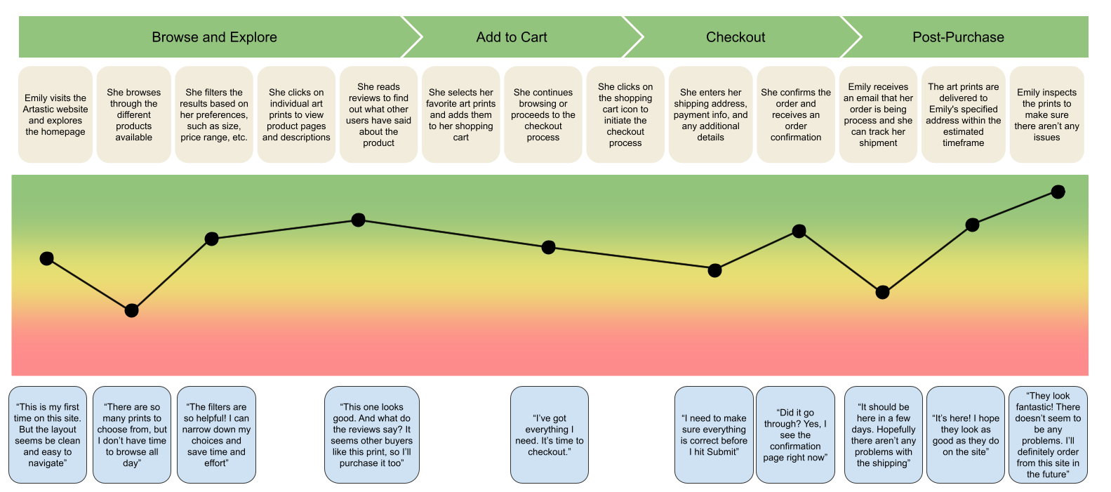
Experience Map
My next goal was to understand the end-to-end shopping experience from the user’s perspective. The purpose of the experience map was to visually outline the user's journey and interactions across different touchpoints, highlighting key insights and pain points throughout the process.
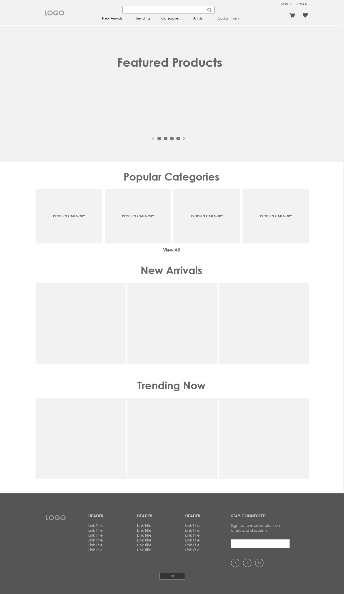
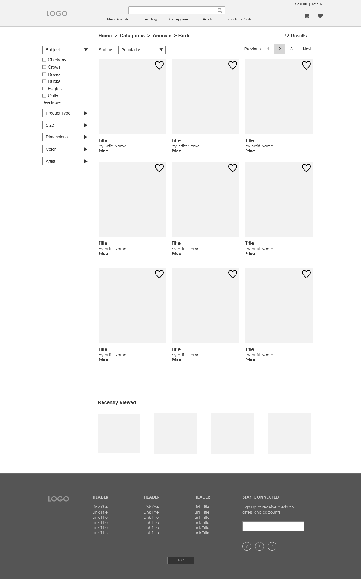
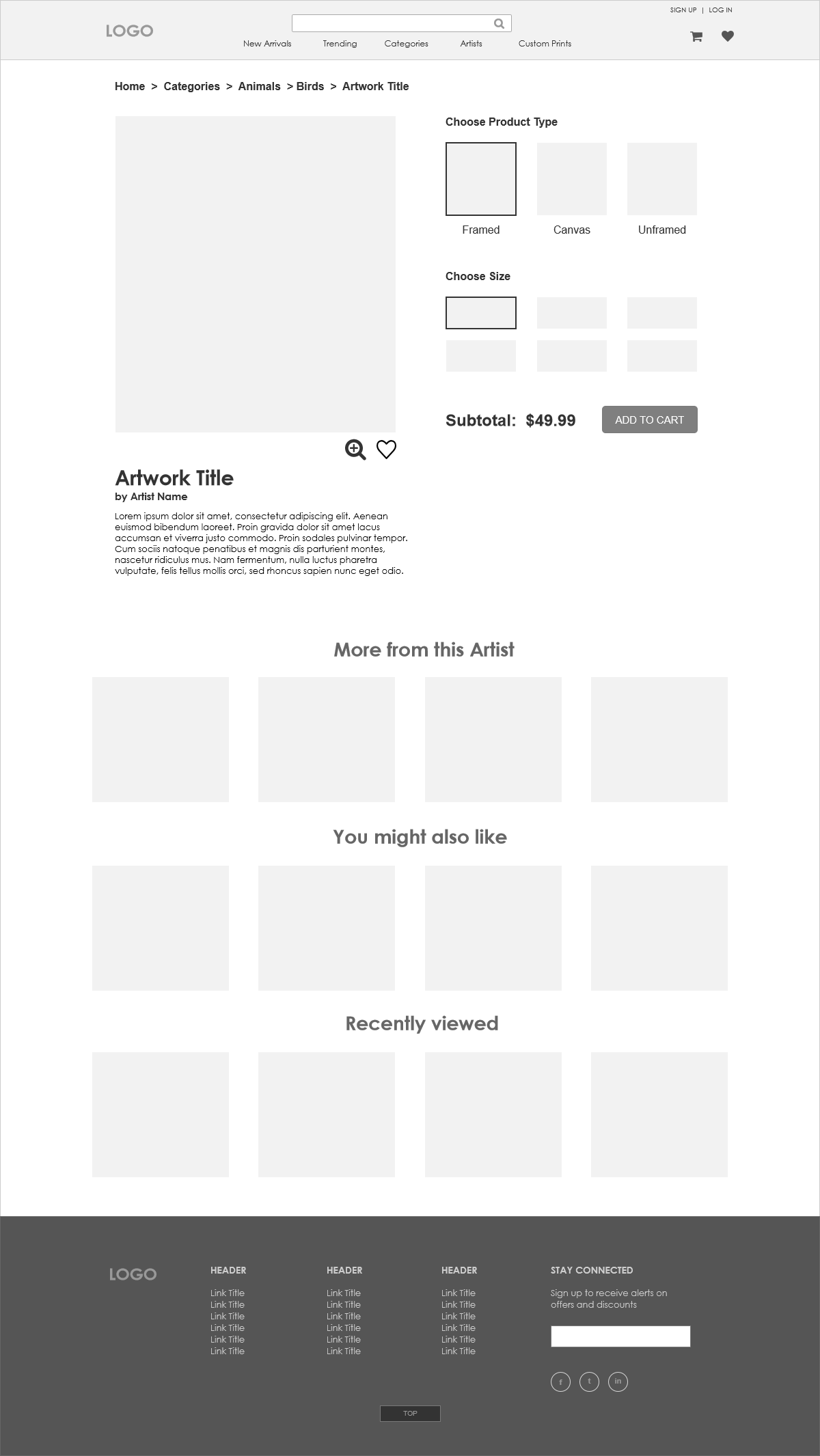
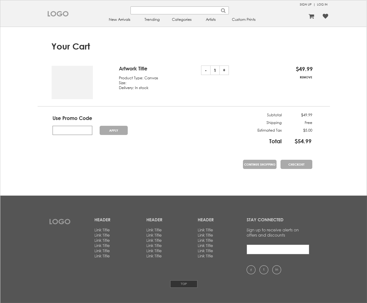
Low Fidelity Wireframes
With the research portion complete, I could move on to the design of the site and started with wireframes for each important section.
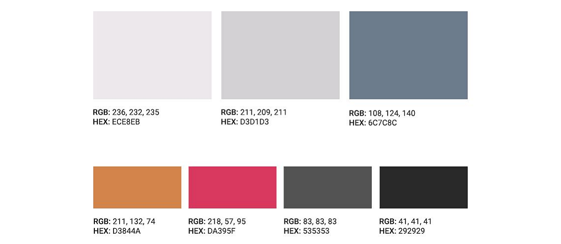
Colors
Because Artastic will be featuring a lot of artwork on the site, I wanted the first two primary colors to be light and neutral so they don’t overpower the actual artwork while the third is used for areas that won’t display artwork like the footer.
The first two colors in the secondary palette are more vivid in order to stand out. The first is used for any calls-to-action such as indicating a product on sale. The second one is used to indicate items that have been added to the user’s wishlist.
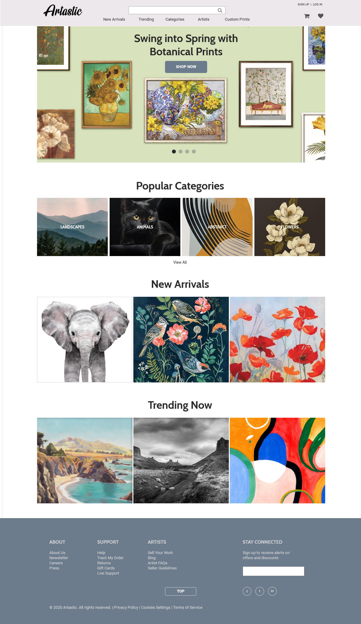
Logo Design
When I first started the logo designs, I placed the name of the site on top of a paint stroke graphic. I tried out four different colors - the three primary colors and black. But I wasn’t satisfied with the results. The colored versions were too bright compared the the muted palette of the rest of the site. Then I looked at the black and white version and went with a different art metaphor.
I experimented with the idea of a logo in the style of an artist’s signature and liked the look of it more. A signature is present on a painting, but it doesn’t become the focal point of the painting. Likewise the logo is present on the site, but the real focus should be the products and not the logo.

I tried out a wide variety of fonts to get the look and feel just right. There were several that mimicked handwritten lettering very well, but were not very legible for a logo. In the end, I settled on a font where each letter was clear and made some adjustments so that they were even more legible when the logo was shrunken down or viewed from a distance.
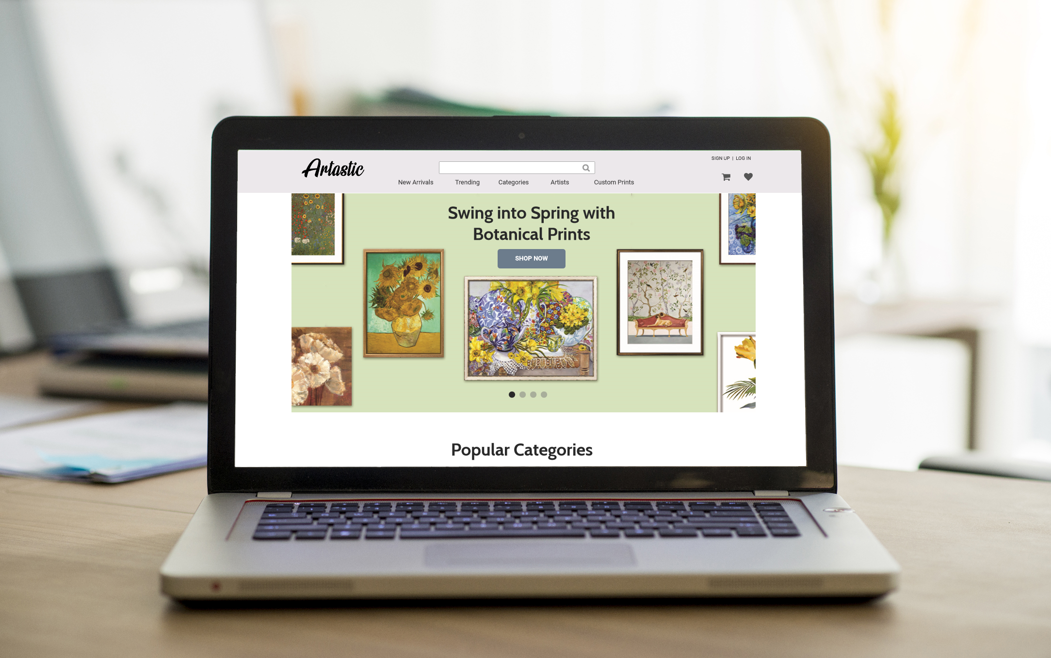
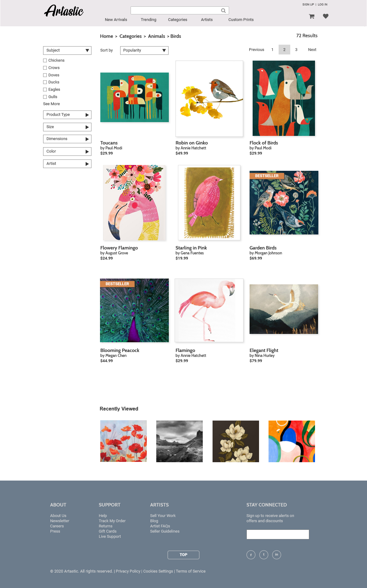
High Fidelity Mockups
Fiinally, it was time to construct the high-fidelity mockups by bringing together the color palette, logo design, typography, and stock imagery into the wireframes to create a refined and polished visual representation of the e-commerce platform.
Prototype
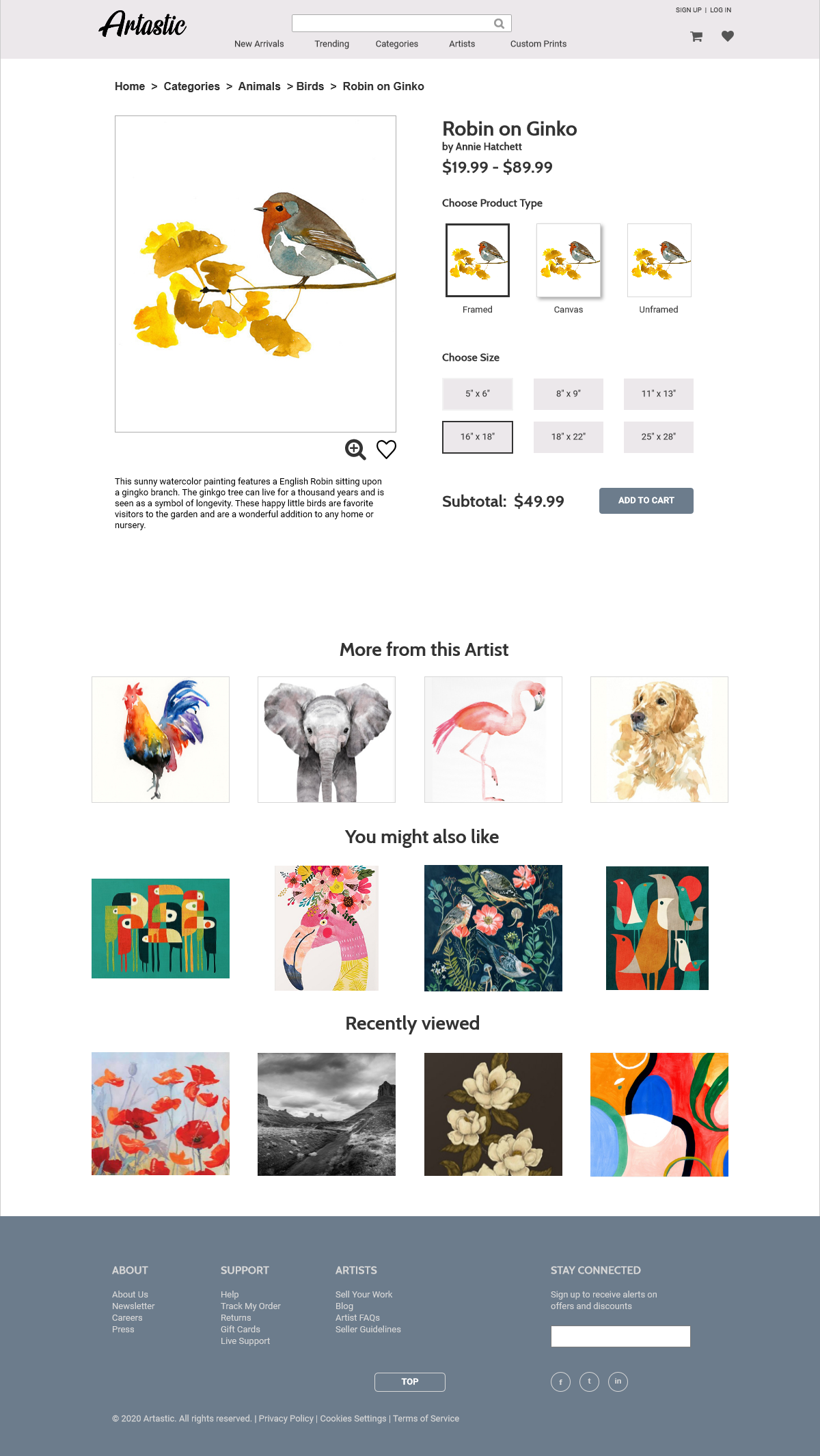
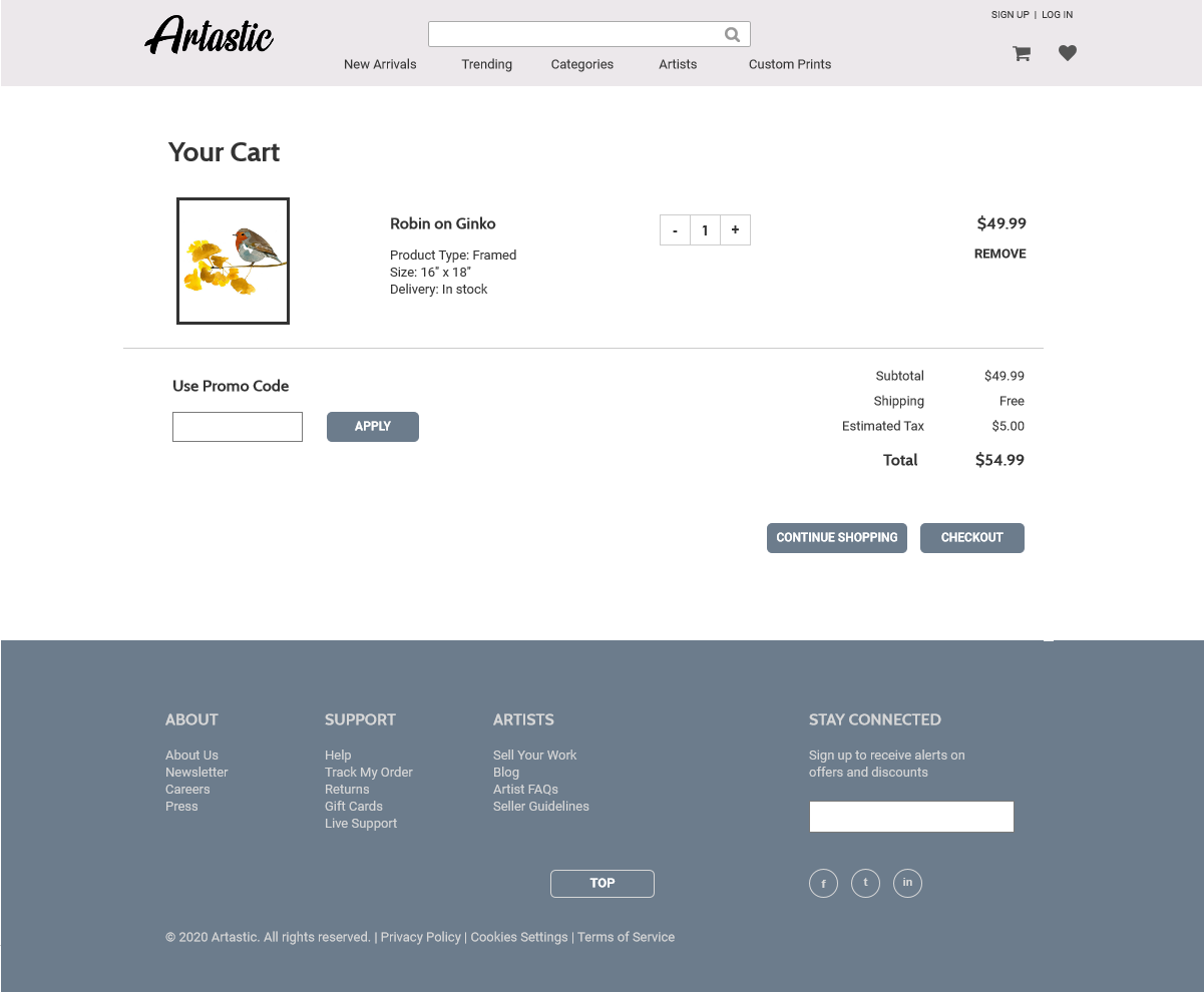
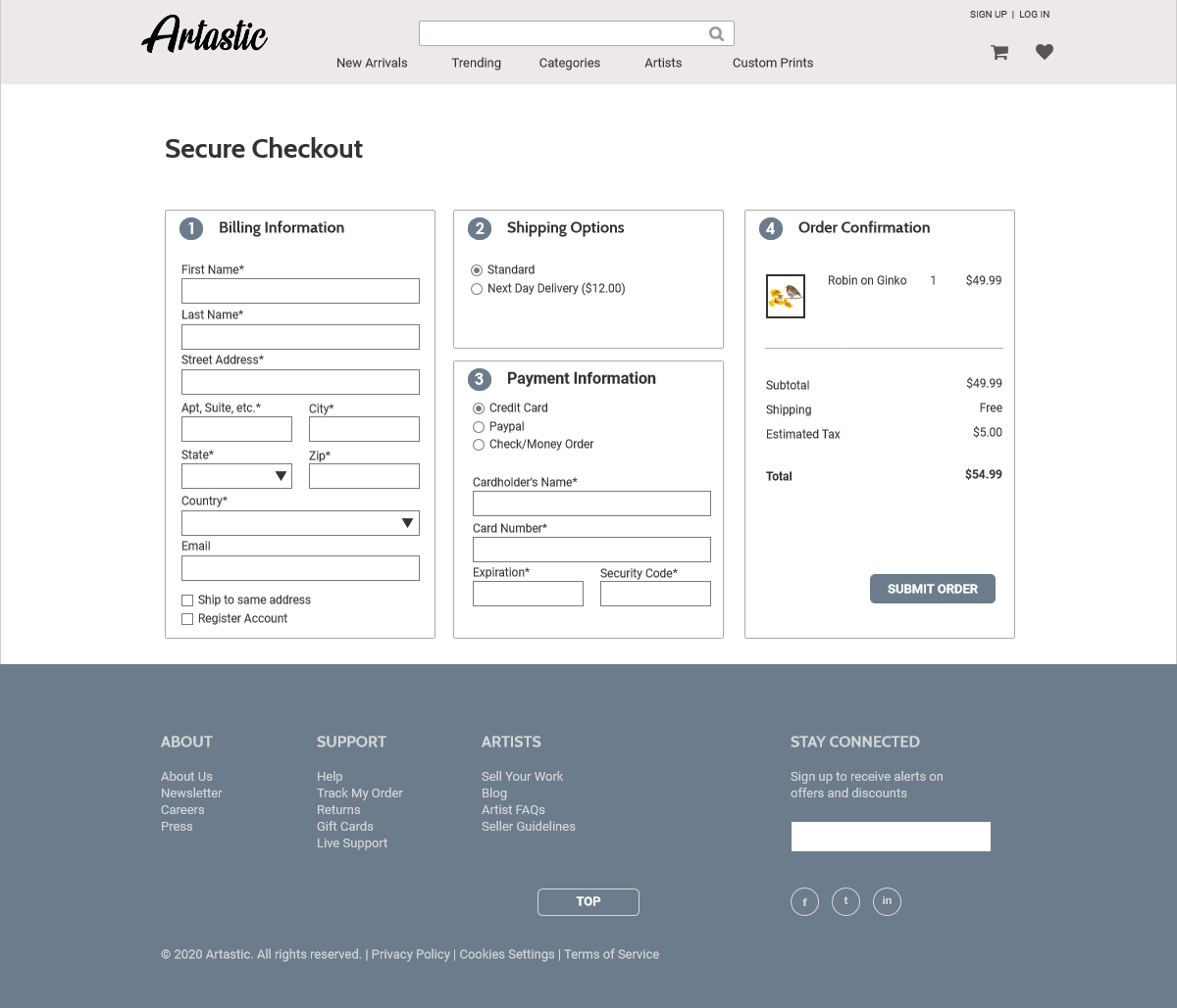
With the mockups completed, I could bring them together into Axure and create a clickable prototype that can be used for the testing phase. While the prototype does not have the full functionality the actual site would have, the user is still able to navigate to a category page, choose one of the products (Robin on Ginko), add it to their shopping cart, and complete the checkout process. This takes the user through all the important pages of Artastic.
Usability Testing
The overall design of the site was completed, and I reached out to multiple people for participation in a qualitative usability test. Over the course of the next two weeks, I prepared a list of six tasks, screened the potential participants, selected five of them, and then scheduled and conducted the tests. The findings from the test proved helpful in detecting three areas of the site that still needed improvement. Full details of the usability test can be found by clicking on the link below.
Final Thoughts
Upon completing the case study for Artastic, it becomes evident that the user experience is at the heart of e-commerce sites. Through thoughtful research, user insights, and iterative design, I've successfully created an engaging and seamless shopping journey for art enthusiasts. With a user-centric approach and attention to detail, Artastic has potential to establish itself as a leading destination for art prints in the competitive e-commerce landscape.