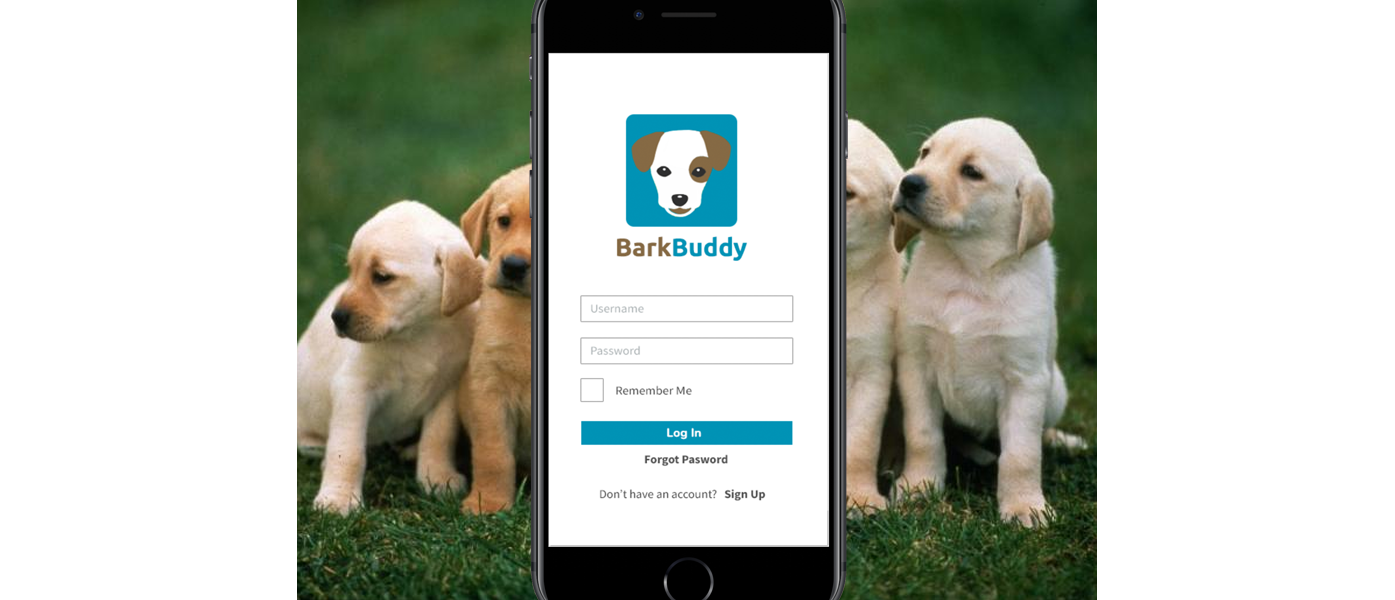
Bark Buddy
BarkBuddy is a mobile app designed for dog owners. It allows users to search and book dog-related services such as walking, grooming, boarding, and daycare. It also lets users search for dog-friendly establishments and events and connect with other dog owners through photos and messaging.
The Goal
Design and develop a mobile app for dog owners with an intuitive and visually appealing user interface, and seamless functionality for searching, booking, and managing dog-related services.
User and Competitor Research
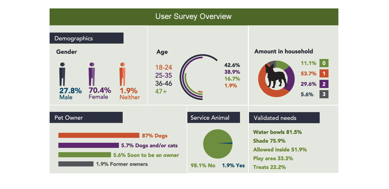
We started the project by researching the potential users for this app. We wanted to know what their main pain points were. A survey was sent out to people on social media and dog-related forums. There were 52 responses to the survey in total and 5 of those were chosen for a more in-depth interview based on how well they fit our target demographic.
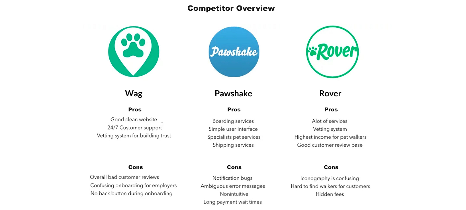
In the interview, they were asked questions such as how often they used services for their dogs, how often they brought their dogs with them to establishments and events, and what methods they used to search for dog-friendly locations. They were also asked what dog-related apps or websites they already used. From this information, we gathered three main competitors - Wag, Pawshake, and Rover. Research was done to find out the strengths and weaknesses of these products.
User Personas
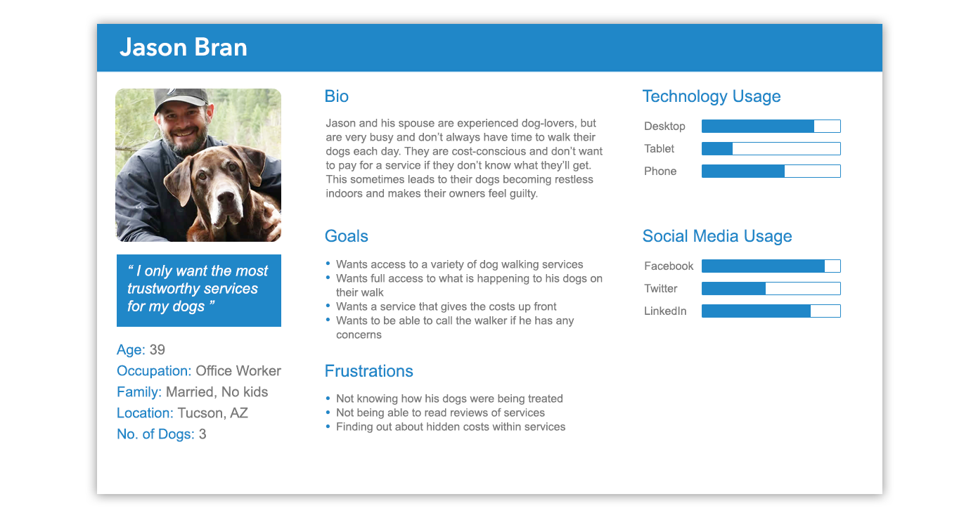
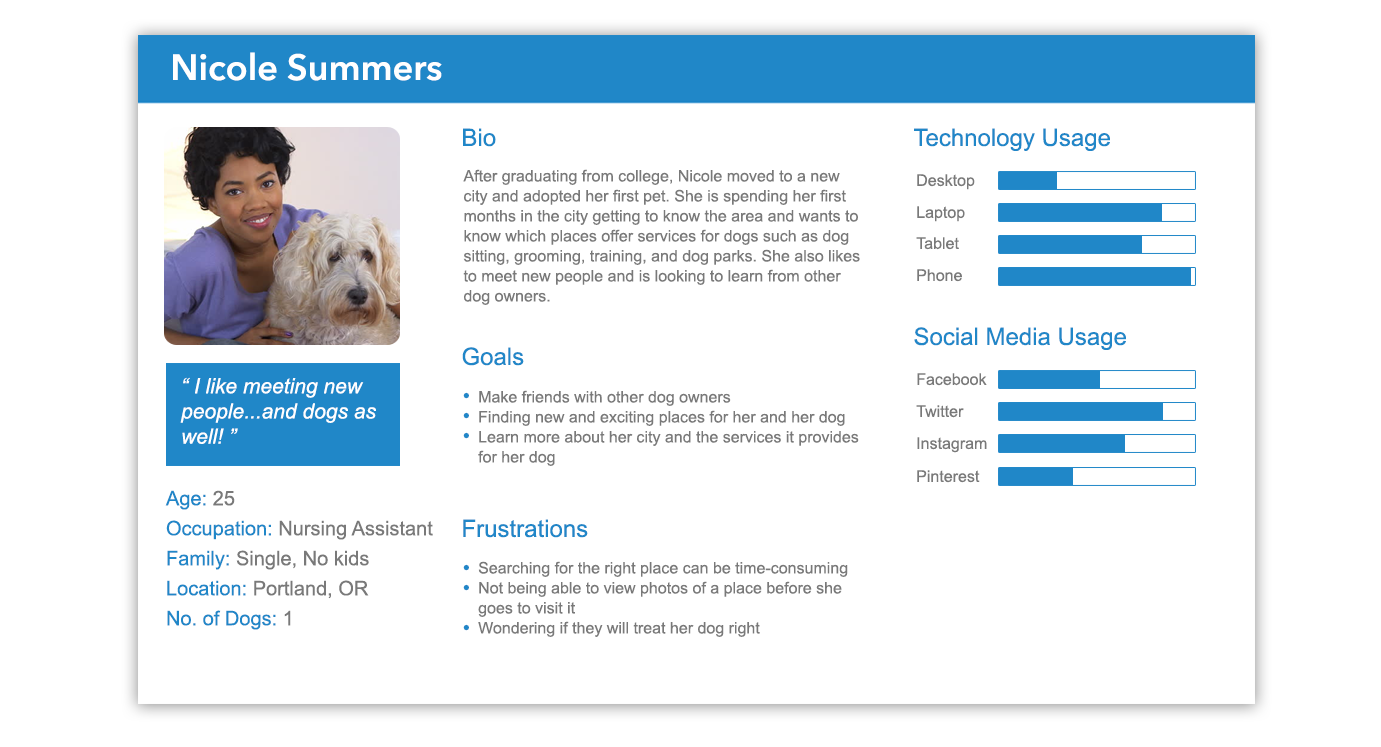
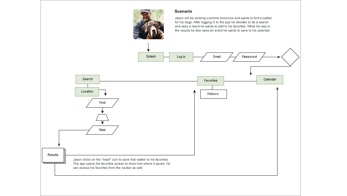
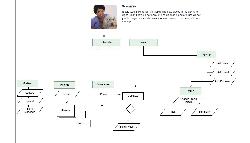
In order to understand the potential users better, we came up with two personas for the product. Jason represented the experienced dog owner who uses the app for services such as finding a walker. Nicole is relatively new to dogs and uses it to explore dog-friendly locations and to meet other owners.
User Journey Map
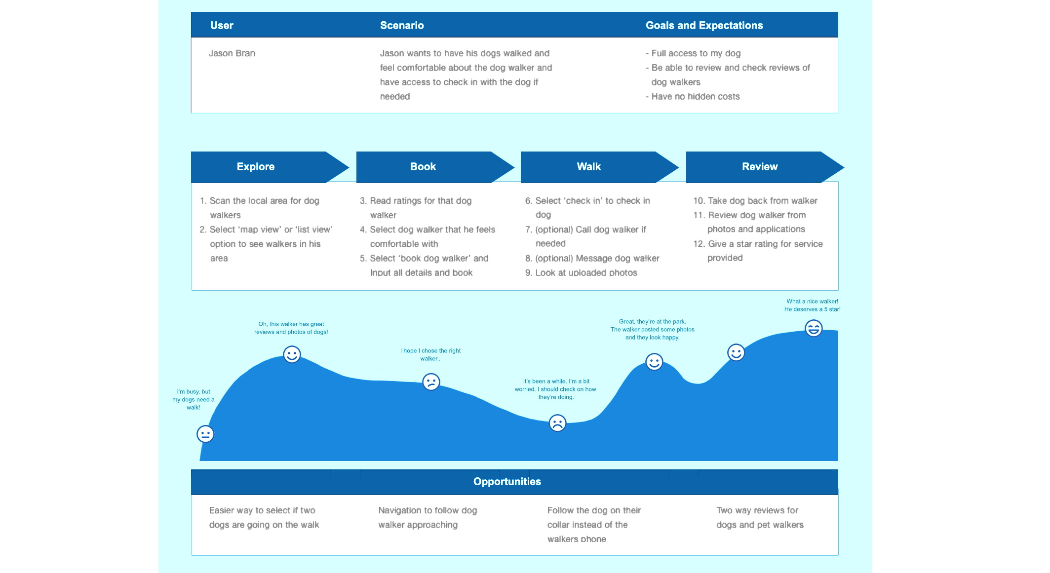
Utilising the user personas, journey maps were created to delve deeper into more touch points of the users and their logic behind the decisions they made. This was done to gauge where the user's pains points would be and to develop further opportunities to improve the overall experience. This was a very effective method that allowed the team to empathise with the potential users of this app.
User Flows
With the personas and their journey maps set up, we evaluated how the users would navigate the app to use its different features. User flows were create to show the different steps users would take from beginning to end. Depicting this process allowed us to optimize the user experience in order to create an intuitive interface.
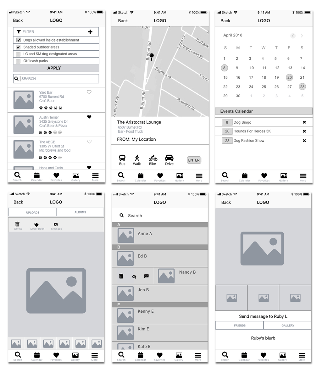
Low Fidelity Wireframes
At the beginning of the wireframing stage, I printed out several copies of a template and sketched my ideas out on paper. This made it quick and easy to make edits and figure out what was and wasn't necessary. I presented these sketches to the rest of the team and made changes based on feedback before continuing on to the digital portion.

The wireframes were done using Sketch. At this stage, all the basic elements such as navigation and content structure were beginning to fall into place. These wireframes went through multiple iterations to make sure nothing important was missing. A selection of these wireframes can be seen below.
Visual Elements
When creating the logo for the app, I did not want to use something that looked similar to ones used by our main competitors. That means no pawprint imagery. Instead, I went with a dog's face so users would immediately know what type of pet this app catered to. I designed it to look friendly, but not too cartoony, and had a good amount of contrast to make it stand out.
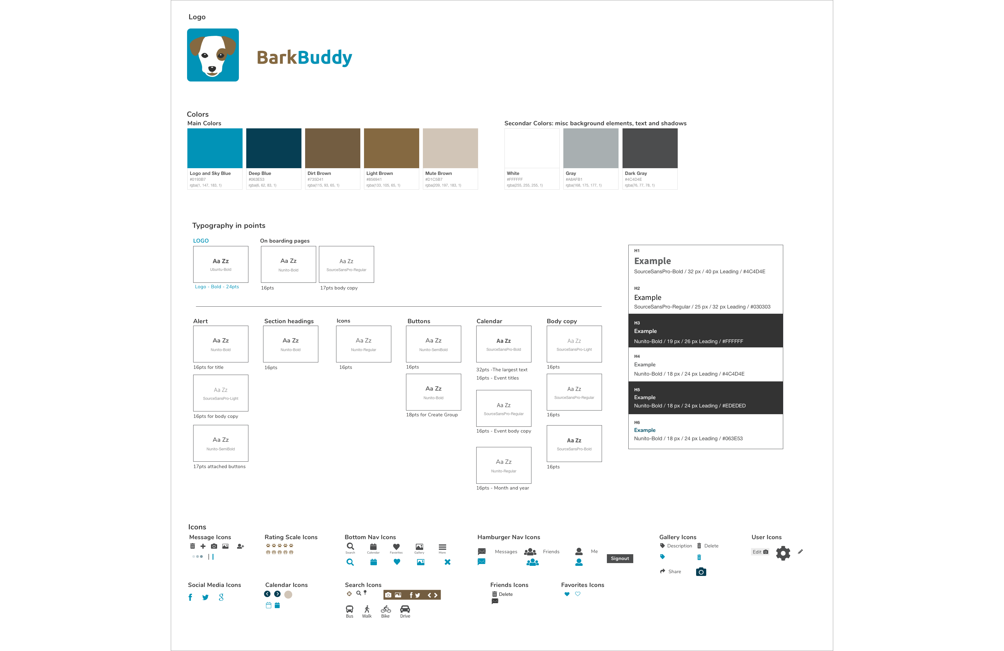
For the colors, I wanted to keep accessibility in mind. Some users may be colorblind, so that means avoiding certain combinations like red & green and green & blue. I went with a warm brown and balanced it with a cool blue. I also made sure the colors provided enough contrast with the text that was placed over them.
Final Screens

Usability Testing
When testing the prototype of the app, we gathered 5 dog owners of various ages. They were given a list of 6 tasks to perform based on the core features of the app. Some of the tasks included setting up an account, filtering search results, adding an appointment to the calendar, and adding a location to the favorites.
The majority of the tasks were completed without any issues. After the test, we asked each user what they liked about the app, what they found confusing, and any suggestions or improvements they had in mind. The search and filter function was one aspect that was well liked by all 5 users. Two of the users suggested being able to share a location or service directly from the favorites screen instead of having to click on the item first. Another user questioned whether it was possible to use to app to take photos, instead of having to exit the app and use the phone's camera feature. This was definitely something we could add to the final product.
Overall, the feedback we gained from these tests were very helpful in knowing what to work on and what to add to make the app a better experience for dog owners.
Final Thoughts
As a UX designer working on this app, I have learned invaluable lessons about the significance of empathy and understanding the unique needs of dog owners. This project has further motivated me to continue leveraging design thinking and human-centered approaches to build products that bring joy and convenience to users' daily lives. With its intuitive user interface, comprehensive features, and emphasis on usability and community-building, Bark Buddy is poised to become an very useful tool for dog owners, simplifying their lives and enriching their experiences with their beloved pets.