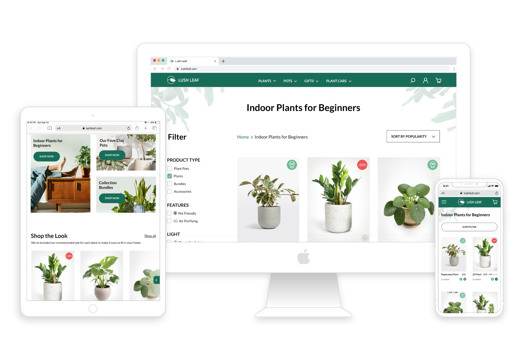
Lush Leaf
Lush Leaf is an online plant shop specializing in indoor house plants and plant pots.
The Goal
Create an online shopping experience with efficient browsing and checkout process, user-focused navigation, intuitive recirculation, and strategic use of popup to increase customer engagement and conversion rate.
Market Research
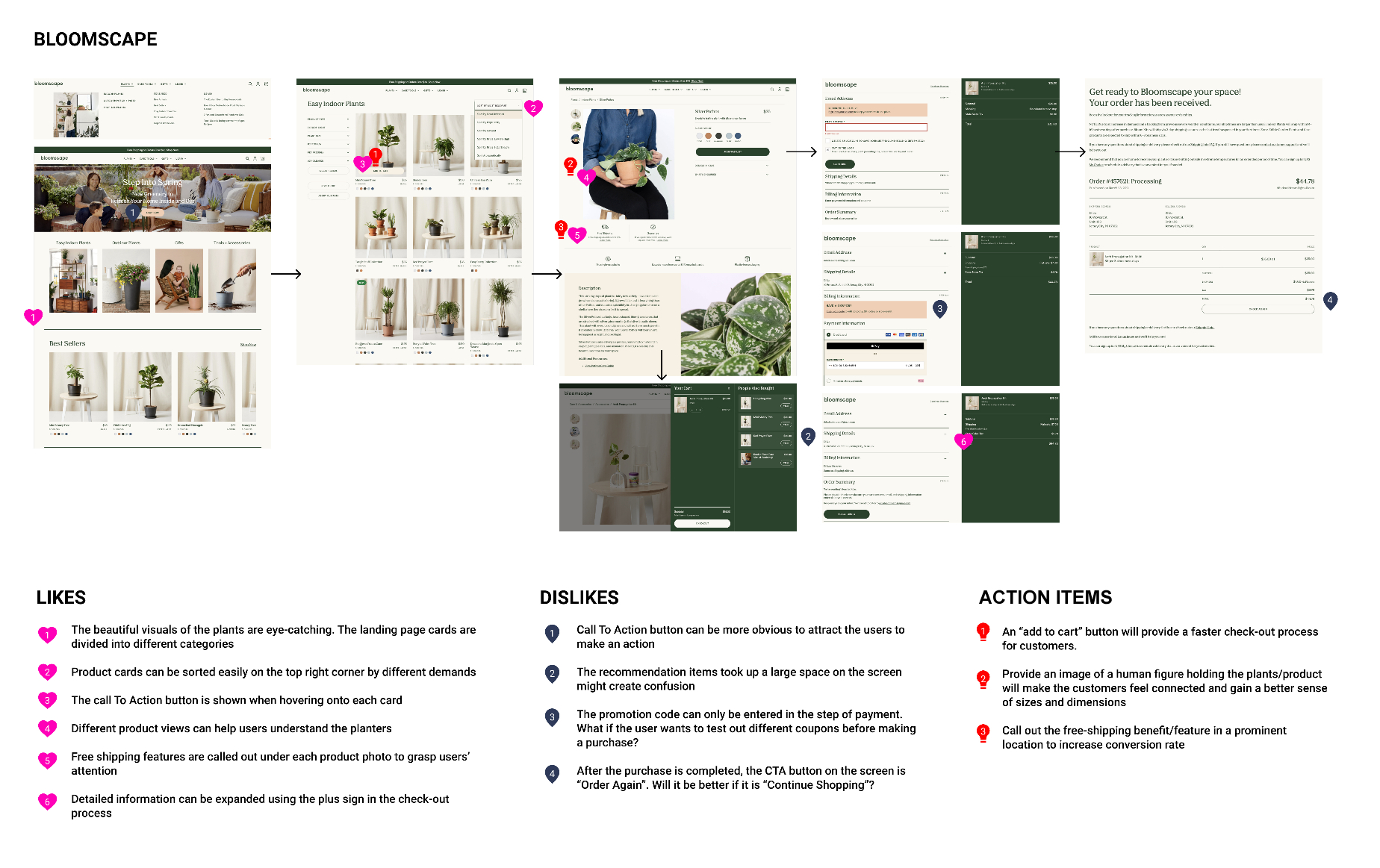
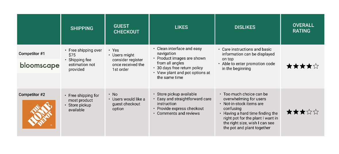
To start, I looked into five industry leaders in the online plant shopping market, which are: Bloomscape, Amazon, Etsy, Home Depot, and The Sill.
Below is an example of an analysis I made on Bloomscape's site, which includes notes on what I liked and didn't like, as well as action items that could be used when creating Lush Leaf.
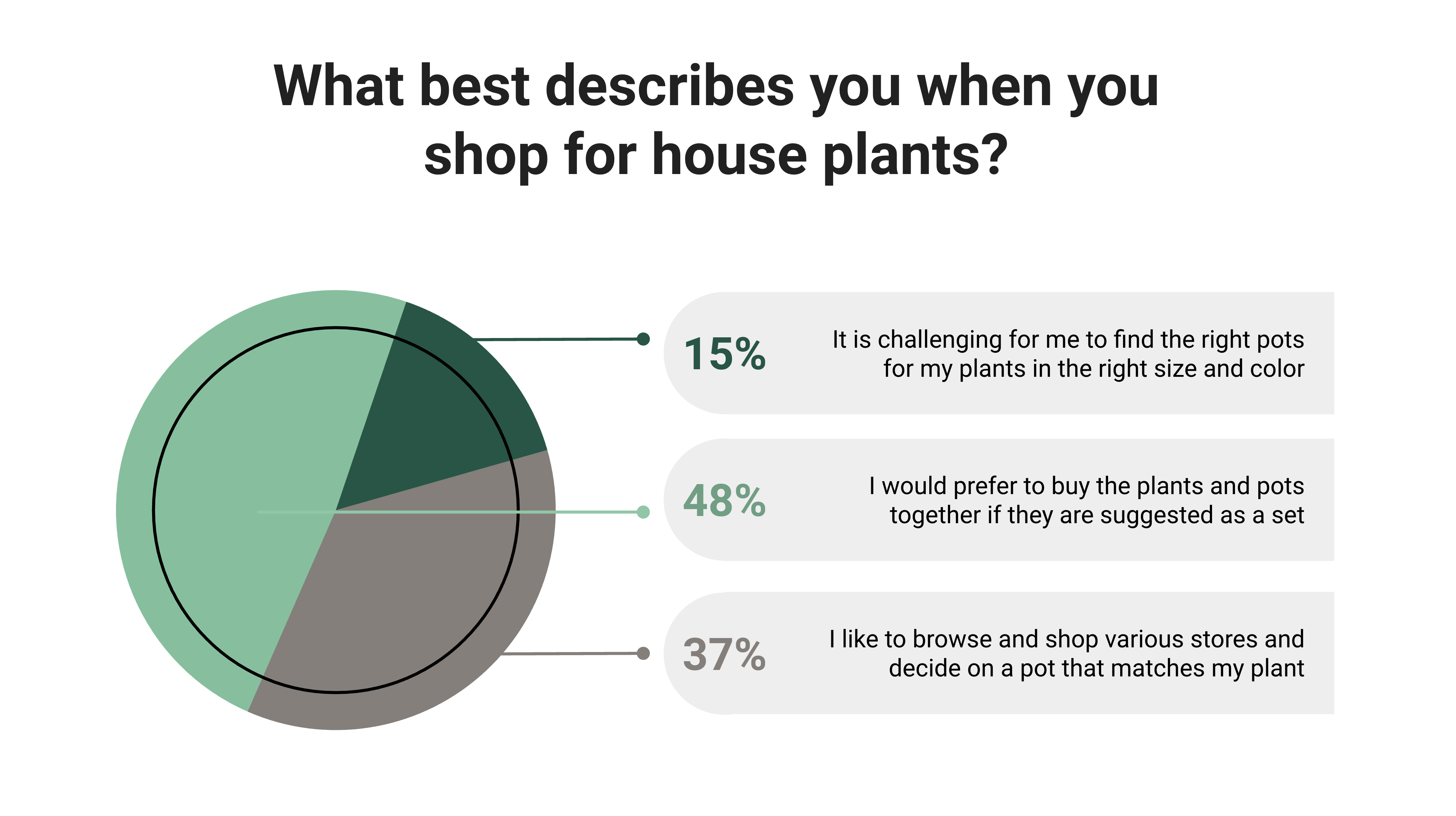
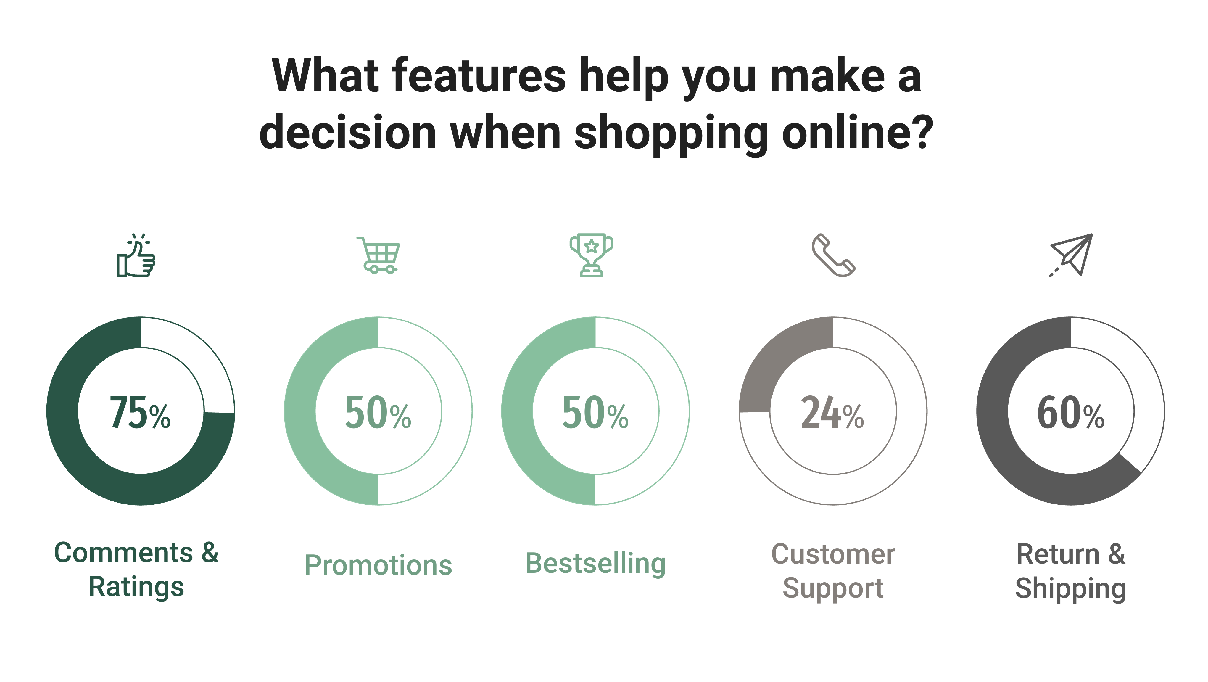
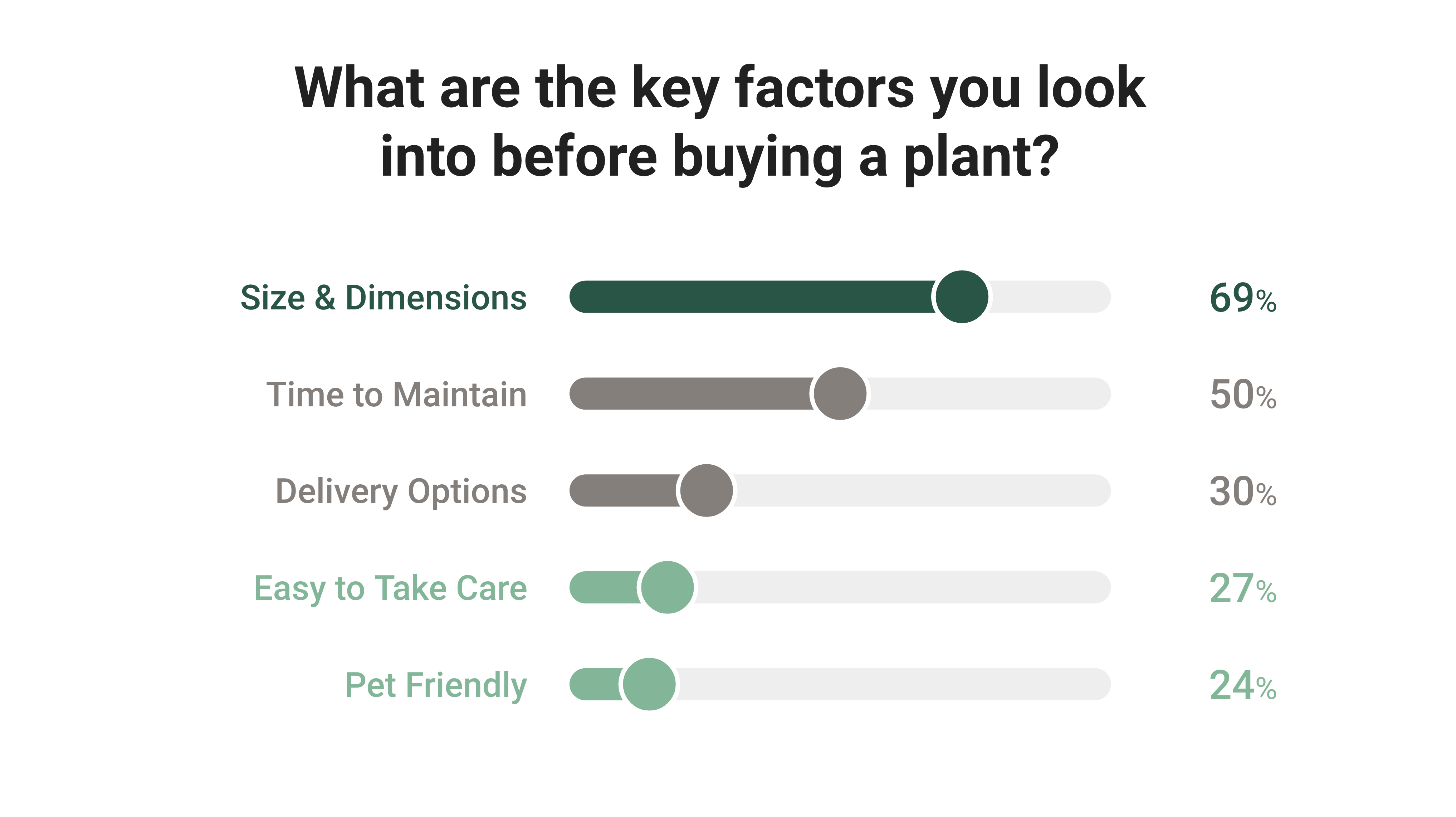
User Surveys
In order to gather more information, I sent out screener surveys to potential users about their shopping habits and expectations for buying house plants and pots online. Here are some key takeaways based on 42 responses.
- 63% of participants are experiencing a hard time picking the right containers for their plants and it would be easier for them if they come as sets.
- Comments & ratings from other users and return & shipping policy matter to them most when shopping online
- Size and dimension of the product and time to maintain the plant are key factors to consider before making a purchase

User Interviews
Based on results from the screener survey, I've started with 5 people for the user interview and competitive usability testing. Not only did I meet people who had online plant shopping experiences from the past, but also those who prefer to buy plants in-store, where I would like to know what stops them from buying online.
After analyzing users' preconceived attitudes and feeling towards the online plant shopping experience, I have synthesized 4 major pain points they have encountered when buying plants online.
Shipping and Return Policy
People are unsure about shipping cost and if it can be returned laterFind an Ideal Plant Pot
People struggle to find the right pot for their plantProduct Doesn't Match Sample
People worry the product does not match the descriptionHassle Free Checkout
People prefer an easy checkout process without registrationCompetive Usability Testing
According to the Nielsen Norman Group, competitive testing allows designers to get feedback from target users early by trying out products from competitors, where I can gain deeper insight into why design elements work or fail and make informed decisions moving forward.
After the user interview, I asked the 5 participants to test out 2 competitor websites and complete the same task.
The Competitors
Bloomscape (boutique style) VS Home Depot (wide selections)
The Task
You would like to buy a money tree, preferably in a blue color plant pot within a $50 budget.
The Results
After the participants completed the given task, I asked them to rate their shopping experience for both websites on a scale from 1 to 5.
60% of the participants would want to use Bloomscape for their next purchase for its easy navigation and straightforward shopping experience.
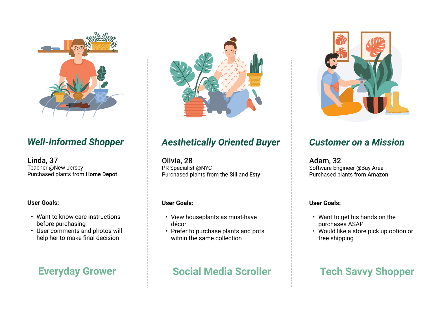
User Personas
After analyzing feedback from user interview and competitive usability testing, I created 3 lightweight user personas for Lush Leaf based on their different shopping behaviors:
- Linda, an Everyday Grower, and well-informed shopper who has an idea of what she wants to buy.
- Olivia, an Social Media Scroller, and aesthetically oriented buyer, like anything that is aesthetically appealing.
- Adam, a Tech-Savvy Shopper who is a customer on a mission, usually on the hunt for a specific product
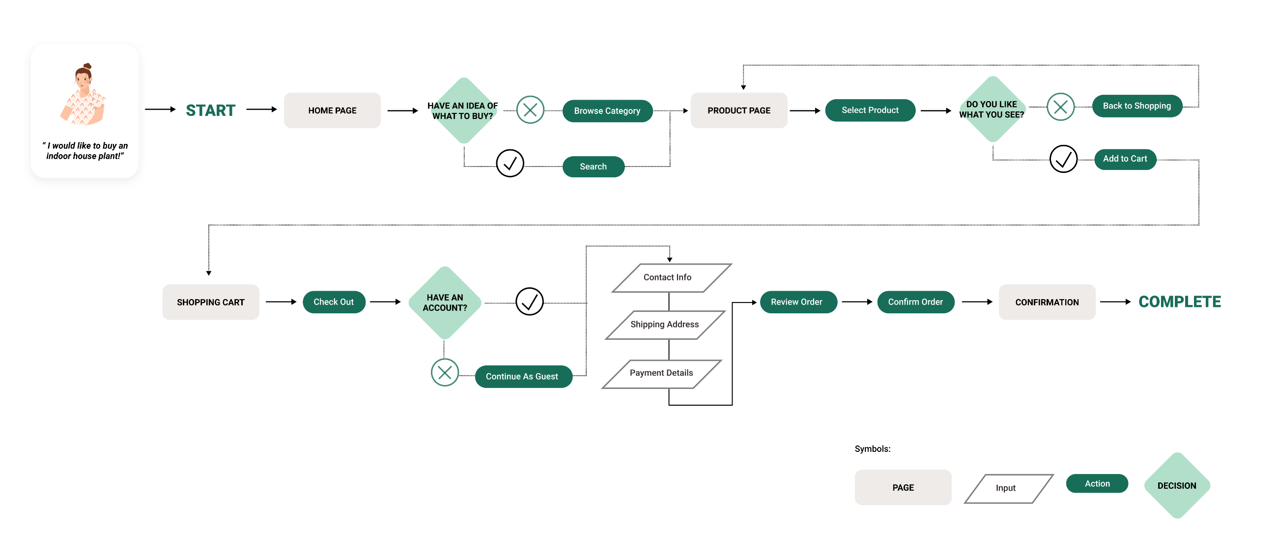
User Flow
I have taken 3 personas needs and goals into consideration and compiled them into one key user flow. Creating a user flow helps me to map out steps a user will take to complete their goal in the most efficient manner.
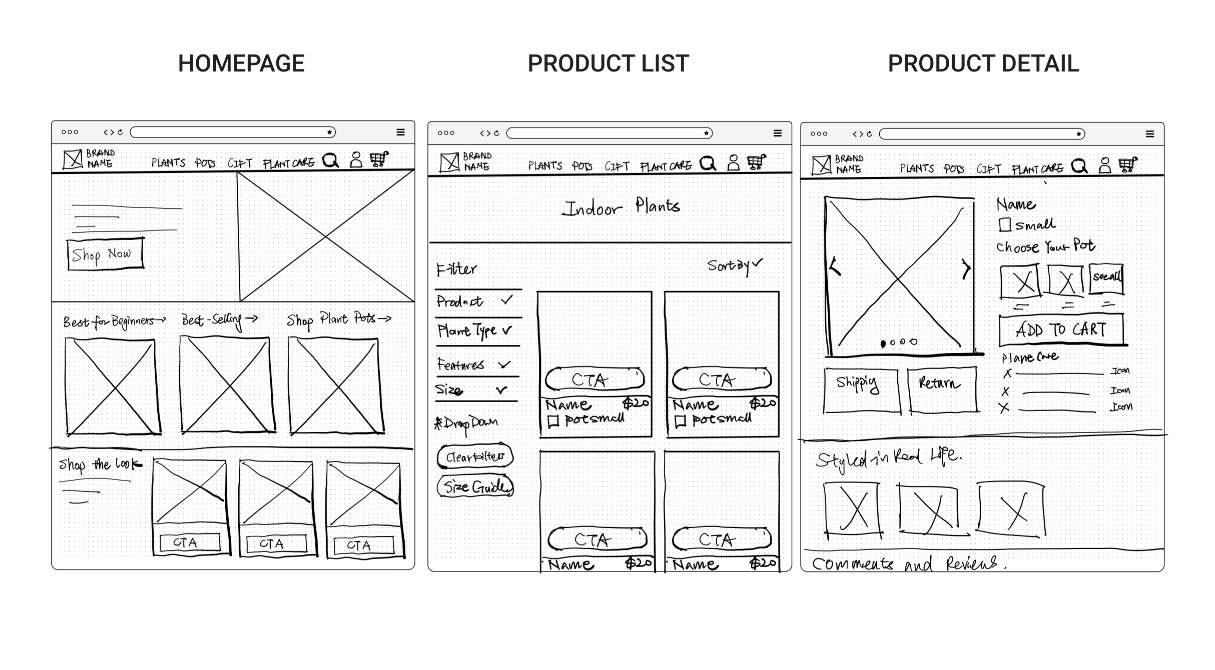
Sketching
I began to sketch the main screens of the website using the user flow as a guide. This allows me to quickly explore different ideas for the page layout.
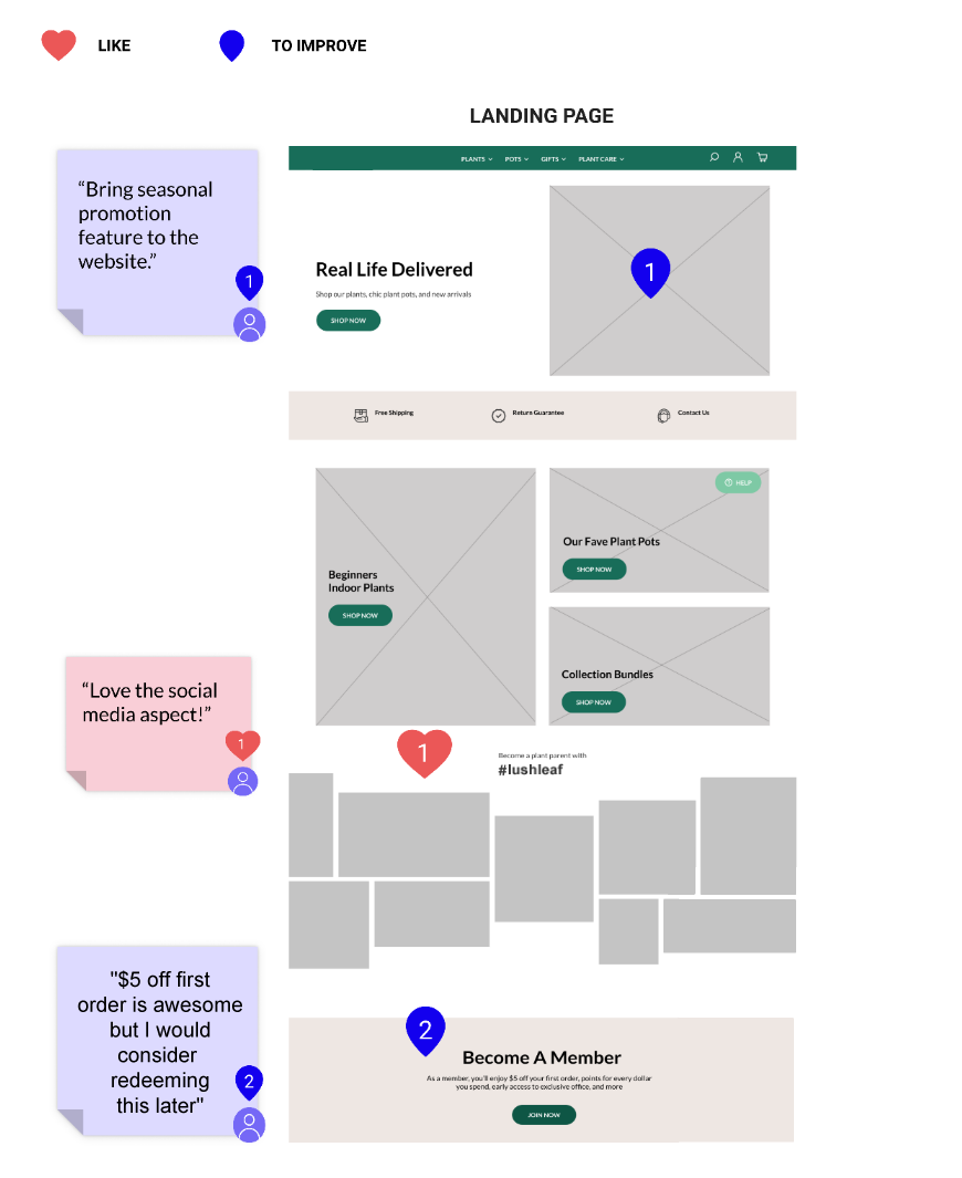
Low Fidelity Wireframes & Usability Testing
After gathering solid ideas using pen and paper, I started to build wireframes using Figma. I made sure to prioritize the features that would best address the needs of the personas. After drafting the testing script, I recruited 5 participants to test my low fidelity wireframes.
Key Findings
After the 1st round of usability testing, here are some major issues that I would like to address later in the design:
- How can I bring seasonal promotions to the website to attract user’s attention?
- All the participants closed the pop-up signup window when they first arrived at the website. How can I make the interaction more compelling to encourage users to sign up and receive $5 off their first order?
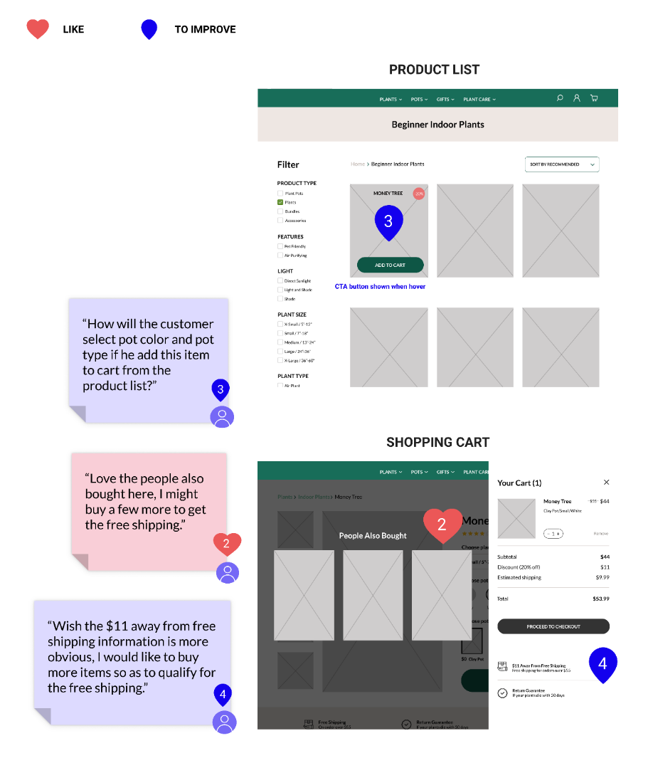
- How will the customers select pot color and type if they click the “Add to Cart” button from the product list without viewing the product detail?
- How can I encourage users to continue shopping in order to qualify for free shipping?
UI Style Guide
While creating the user interface, I paid special attention to the persona's needs and brand attributes which are Modern, Earthy, Peace, Inviting, and Balanced. I ensured the color and text contrast ratios using the WebAIM Contrast Checker and Web Content Accessibility Guidelines.

High Fidelity Prototype
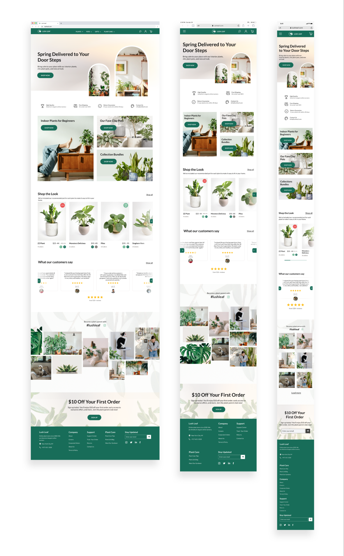
Taking the feedback from the 1st round of user testing and the visual identity, I constructed the high-fidelity screens for both mobile, iPad, and desktop.

Usability Testing
When asked during my initial user interviews in the research phase, users disclosed that they are more likely to make a purchase on a desktop device, so the testings were conducted via Zoom screen sharing using a Figma prototype on a desktop device.
Test Objectives: Gather user feedback on the entire process and identify usability and accessibility issues.
Participants: 7 people total, a mix of plant parents, designers, and unaffiliated users.
100%
TASK COMPLETION RATE
80%
REDEEMED COUPON AT SHOPPING CART
60%
NEED CLARIFICATION ON PRODUCT CONTENT
- All participants can easily complete the given tasks from browsing the products to checkout.
- Users enjoy the look and feel of the website and the social media implementation attracts their attention.
- Users are familiar with the checkout patterns which they are comfortable making the purchase.
- I provided the slide-in popup window at 2 places. Users prefer to redeem the "$10 Off Coupon" when they added the product to a shopping cart, comparing to when they are browsing the product page.
- Users would also want to test the coupon code right away before proceeding to checkout.
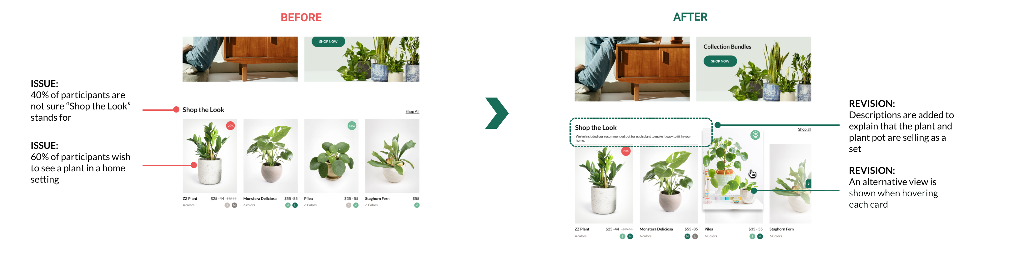
- Users expressed the need to preview the plant in a home setting and further clarification on what "Shop the Look" stands for.
Revisions
Based on feedback from the usability tests, I made revisions to the designs, one of which included clarifying a section of the site users expressed confusion over.
Final Thoughts
Overall, I really enjoyed this experience and learned a lot about plant knowledge and e-Commerce UX.
My key takeaways include:
- Plan ahead - I couldn't deliver a finished product without the help of people using the product. Arrange the testings ahead of time and let the users know what device they should use would definitely resolve technical issues and accelerate the process.
- First impressions count - The human attention span can only last for 8 seconds. If the users find your site less inviting or engaging, or not optimized for browsing on various devices, they’ll go somewhere else. Designing a responsive e-Commerce site is a crucial and valuable experience.
- Detail matters - Changing the upfront registration window to slide-in positions and adding a minus sign to the number of dollars people saved in their cart may not appear to be big innovations but these changes will clear users' frustrations and eventually increase conversion.
- Users first - Seeing the product from a user's perspective, I challenged myself to ask the same question on every page of my site- does the user know where to go next from here? If not, what do I need to change to do that?