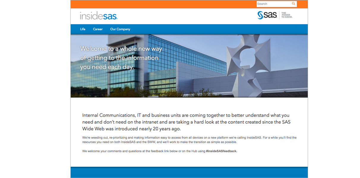
InsideSAS
InsideSAS is a major redesign of SAS Institute's intranet site used by thousands of employees everyday.
The Problem
SAS Institute employees were having trouble finding resources and information regarding all manners of employment and life at the company
The Goal
Modernize the UI and information architecture of the entire site, addressing specific pain points around navigation and efficiency
The team divided its intranet discovery research into several steps and used multiple methods to understand needs from different perspectives. This approach increased confidence in design and prioritization decisions.
Contexual Inquiry
We wanted to learn how the over 10,000 employees in different roles used the intranet in the office and remotely. We began by conducting a series of contextual inquiries to observe the daily work of employees. By narrowing in on select processes and tasks, the team learned that one of biggest challenges for employees was navigating through the cumbersome menus and links in an attempt to find the information they wanted. This heavily interfered with their productivity and caused unnecessary delays.
These findings prompted further investigation before creating designs for the new intranet.
User Interviews
To understand employee preferences, attitudes, and opinions, we conducted 15 in-person interviews with employees. Interviewees’ intranet usage ranged from once per week to daily. The findings from the interviews helped us identify several needs and pain points. This data also informed the visual design and content strategy for the new intranet.
Surveys
To collect even more insights from a large pool of employees, our team sent surveys by e-mail to 100 people from different departments - Human Resources, Information Technology, Research and Development, Business Administation, Sales/Marketing, and Finance/Accounting. Here are the three major pain points we've found:
- 83% of participants experienced a hard time navigating the intranet to find the information they needed including benefits, leave policy, and internal contact directories.
- 32% of participants were unware the site had resources for career advancement at SAS, impacting employee retention as they seeked advancement at other companies.
- 45% of participants mentioned the site had too much text and lacked visual elements, making it difficult to quickly scan and absorb key information.
Card Sorting
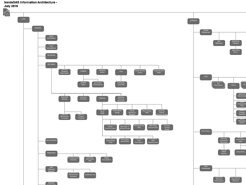
The information from the surveys and user interviews revealed an overhaul of the intranet’s navigation was needed. We conducted an in-person open card sort to find the best way to organize the important pages into five main categories - Benefits, Policies, Career, Company Info, and Support Services. After analyzing the results, we decided that the pages could be further consolidated into just three major groups and we called these Life, Career, and Our Company. We implemented this navigational structure into the site's information architecture.
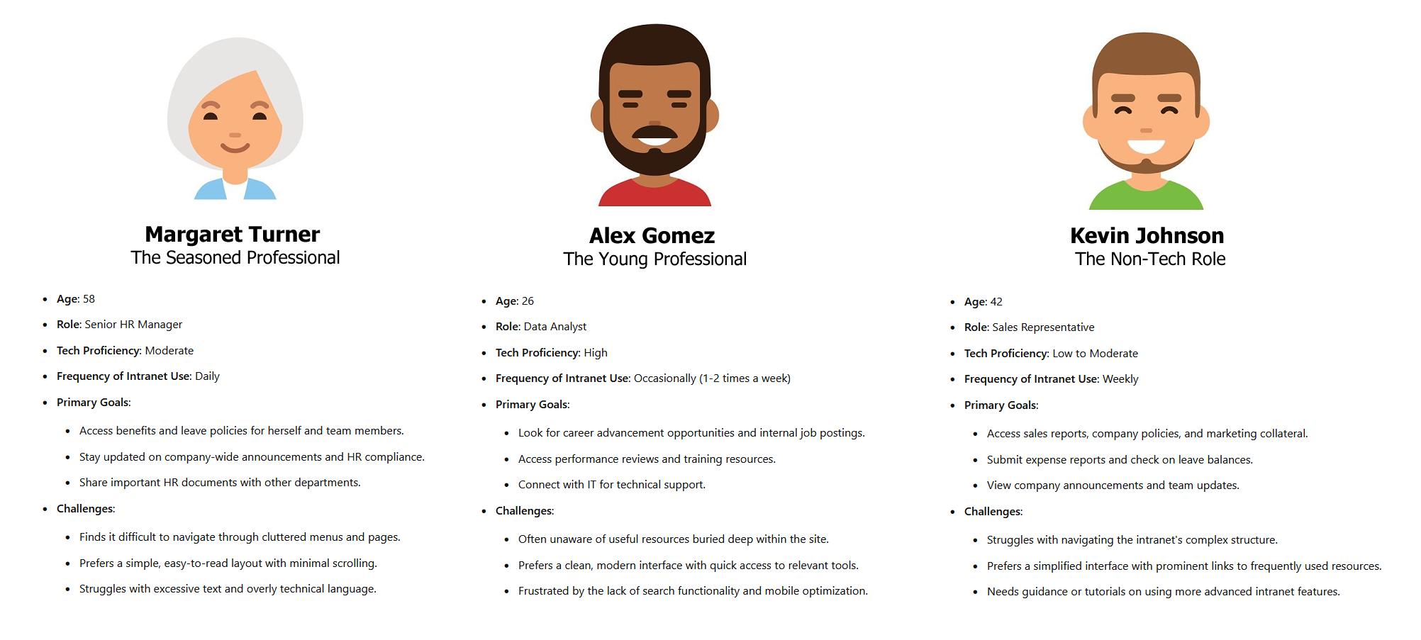
User Personas
To ensure the intranet redesign met the diverse needs of all employees, we developed user personas based on the insights gathered from surveys, user interviews, and observation. These personas represent key employee groups at SAS, capturing a range of technical proficiency, job roles, and common use cases for the three main categories of the intranet.
- Margaret represents older professionals seeking easy access to benefits and company policies.
- Alex represents younger employees focused on career development.
- Kevin represents those in non-tech roles needing simple, intuitive access to essential company tools and resources
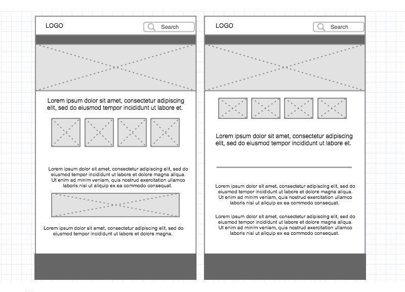
Wireframes
For the wireframe development of the intranet, we began by selecting a responsive WordPress template similar to the one used on SAS's main public-facing website to maintain visual consistency and brand alignment. However, we recognized the need for personalized pages tailored to the unique needs of internal users. To address this, we customized specific sections of the template, creating layouts for key areas like employee resources, HR policies, and career advancement tools, ensuring an intuitive and user-centered experience across all devices.
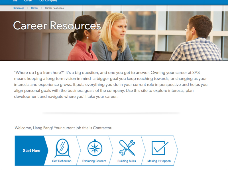
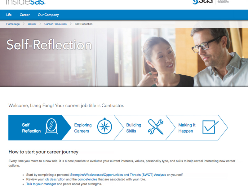
My Career Journey
"My Career Journey" is a key feature of the Career section, designed to address the issue of employee retention by offering a clear, structured path for professional growth at SAS. It breaks down career advancement into four intuitive steps: Self Reflection, Exploring Careers, Building Skills, and Making it Happen. Each step includes carefully curated links to guides, videos, and other resources, seamlessly integrated within the workflow to prevent information overload. This approach ensures employees can easily access the right tools at the right time, making their career progression more manageable and engaging.
Style
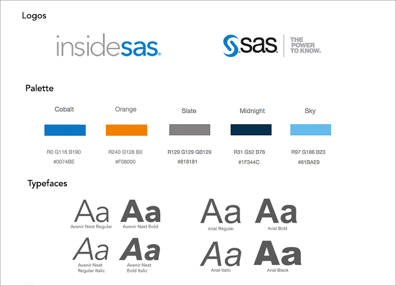
The intranet’s style mirrors the public-facing SAS site by using the same core colors and fonts to maintain brand consistency. However, to distinguish the internal platform, we introduced a complementary orange alongside the standard SAS blue, signaling to users that they are navigating the intranet. Additionally, we designed a new logo for the intranet, named InsideSAS, incorporating visual elements that ensure color-blind accessibility. This distinct branding helps create a unique, recognizable space for employees while staying connected to the overall SAS aesthetic.
Usability Testing
After creating an initial prototype, we conducted usability testing in SAS’s state-of-the-art Research and Development lab. A moderator facilitated the sessions, guiding selected users through specific tasks, such as navigating to HR policies, finding a form in career resources, and accessing support services. By observing their behavior, we gathered critical insights on how intuitive the navigation and layout were.
Key Findings:
- Navigation Clarity: Users completed most tasks successfully, but had difficulty locating a specific page buried in submenus, reinforcing the need for a more streamlined, top-level navigation.
- Task Completion Times: Users successfully completed tasks 30%-80% faster on redesigned pages, proving the efficiency of our layout and information architecture improvements.
Project Conclusion
After multiple rounds of usability testing and iterative revisions, the redesigned SAS intranet, InsideSAS, was successfully launched. The final version improved not only the user experience but also achieved key business objectives, including increased employee satisfaction and retention. By focusing on user-centered design, intuitive navigation, and accessibility, we created a platform that serves the diverse needs of SAS employees across departments.
Through this project, I learned the importance of iterative design and constant user feedback. It reinforced how critical it is to balance business goals with user needs, especially when working with a large, diverse user base. I also gained a deeper understanding of the complexities involved in designing for accessibility and responsive design, as well as the value of cross-functional collaboration in delivering a high-quality, user-centered product.
97%
Employee Satisfaction Rate
20%
Increase in Employee Retention
30%
Decrease in Average Time need to Complete Tasks